A quick overview of design principles that can be used to improve any dashboard.
What's the Purpose of a Dashboard?
Dashboards are information management tools that track, analyze, and display the most relevant and important data for a company, program, or process. Data displayed usually relates to key performance indicators (KPIs) and can be customized to fit specific needs. If you'd like to learn more about three common types of dashboards (operational, strategic, and analytical), check out this resource.
Dashboards provide real-time data based on KPIs, synthesize and simplify that data into visual and easy-to-digest displays, and (ideally) help users make informed decisions about their processes and performance. Some dashboard displays are static while others allow users to filter data based on their needs and to dive deeper into specific areas if they want more information. The most important function of any dashboard is to display information that users need or want to see in a way that helps them easily understand data trends and encourages further exploration.
So, how can you create better dashboards? Here are some tips to get you started.
1. Display of Data
Since dashboards are used to quickly identify and analyze KPIs, the order in which data is displayed is critical, and can either support or detract from this goal.
F Reading Pattern
In English, people read in an F pattern, from left to right and down the page. Our eyes are trained to seek information in this pattern, so it's helpful to arrange data in this way, by placing the most important or most general information on the top left or center of the page, less important or more specific information on the bottom left and top right, and the least important information on the bottom right.
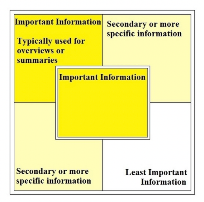
You want users to move from general information to more specific to support the information scent, help them find what they're looking for and know where to go next. By using this common reading pattern, you will also maintain consistency with other dashboards, which matches users' mental models and reduces cognitive load.
Encourage Data Exploration
Display data in a way that encourages users to explore data sets and compare or contrast information. By placing related data in close proximity or in the same view, users will be able to compare data trends that they wouldn't typically pair together and potentially gain new business insights.
Hide unrelated information altogether or in different views to reduce cognitive overload. However, try to limit the number of view to 3-4 to avoid overwhelming users with data. Most dashboards should be limited to one screen (and no scrolling!), but if alternate views are necessary, use tabs with clear labels for easy recognition.
Enable Customization
Many dashboards allow users to customize their views based on the information that's most important or useful to them. When customization is enabled, people can set KPI thresholds to alert them to specific trends, add or remove data sets, or arrange data that makes the most sense to their work flow. When someone customizes their dashboard and generates their own layout, this enhances their recall of item locations because the placement is meaningful to them, which ultimately helps them find relevant data quickly.
2. Visual Cues
As dashboards rely on visual displays of information, it's important to think about the following UI methods.
Visual Hierarchy
Use visual cues like borders and headers to display the hierarchy of information and help users distinguish between areas of data. This also supports recognition-based scanning, helping people find the most important information. If data is equally important, use same-level headers.
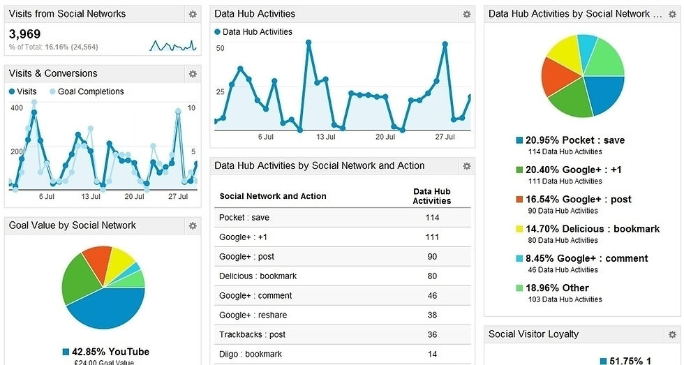
For data that shares the same meaning, like yearly revenue and monthly revenue, use consistent data representation, or the law of similarity, to let users know that this data can be interpreted in the same way. Use variation for data that doesn't share the same meaning or interpretation. The chart below shows two types of graphs, signifying that each type (line charts or pie chart) can be interpreted in a related manner or has similar elements.
Colors
Color plays an important part in signaling function. Don't distract users from their main goal of understanding the data by using bold colors or motion on information that's not important. Strong colors stand out far more than less vibrant ones, so use them to draw attention to important changes or critical data. If you overuse bold colors, especially red, users may become accustomed to them and won't notice warnings or changes in data.
Certain colors cancel each other out and may be difficult to discern from each other, like red and green, yellow and blue, and white and black. Try to avoid pairing these opposing colors together, as it makes it more difficult to determine differences in data. Instead, pair strong colors with paler or less vibrant hues for easy readability. You should also take into consideration accessibility when choosing colors, especially for graphs that use overlapping colors or shades that are too similar. In the below pie chart, the shades of green and yellow on the right are too similar, making it difficult for many users to distinguish.

Gestalt Principles
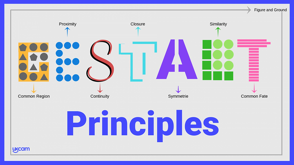
Gestalt principles can be used to make designs more aesthetically appealing, functional, and user-friendly. They take into account how the human brain perceives and organizes visual information to better understand the context and environment we're in, and can be applied to any design. When used with dashboards, Gestalt principles help users more easily extract information. Below are five principles commonly used in dashboard design:
• Proximity - we think that items closer together are grouped and items farther apart are unrelated. On dashboards, groupings of data help users quickly identify related information.
• Similarity - items appearing similar, in either shape, color, size, or orientation, are related or grouped. On dashboards, this is helpful when similar data sets or graphics cannot be placed in close proximity but are still related.
• Continuity - our eyes follow the smoothest line, even if the line is broken (think line charts).
• Closure - even if shapes are incomplete, for example, if a square does not fully touch on all four sides, our eyes perceive them to be whole. On dashboards, this principle is used on certain graphs, like bar graphs or line charts, where the x and y axes connect. Our eyes perceive this to be a full square, which helps users to quickly understand that any information situated in that square is related to that data set rather than surrounding elements.
• Common Region - we think that items sharing a common boundary are grouped. On dashboards, grouping related data sets by boundaries helps users understand which data sets belong together, even if unrelated data is in close proximity or has a similar appearance.
3. Data Representation
Type of Graph
The main goal any dashboard user has is to quickly find, interpret, and understand relevant data and trends. When choosing a display method for data, it's helpful to ask three questions:
• Who are the intended users and what do they need or want to see?
• Which display method communicates the meaning of the data most clearly?
• How big is the display or how much space can it occupy?
Below are some of the more common data display methods.

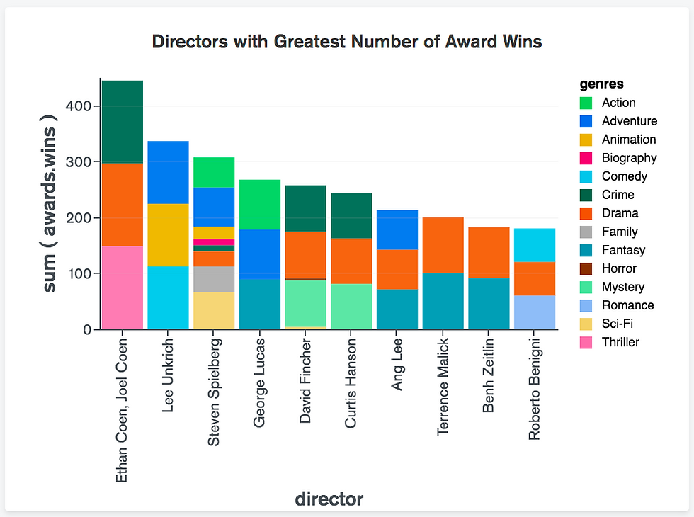
• Bar Charts: this is a great option for summarizing data that is defined by categories. It's also a great comparison tool to gauge how items or categories are performing against each other.
• Stacked Bar Charts: help viewers analyze individual categories within a whole data set.
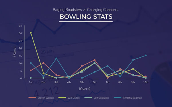
• Line Chart: this chart shows measurements or values of data over time, and users can typically set date ranges for data sets.
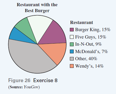
• Pie Charts: display data in a circular shape, with each section (or category) of the pie representing a specific percentage of the whole data set. Be careful when using pie charts, as users often find it difficult to gauge values of individual sections. Having to constantly refer back to the legend to understand the chart hampers users' understanding and forces them to use short-term recall rather than recognition.

• Gauges: display the value of a single KPI against an intended metric. Since this type of chart only measures one KPI, it's often more useful to combine similar data sets into a more complex chart, like a bar chart, to conserve a dashboard's limited space.
Final Thoughts
Designers should invest time into learning best practices in dashboard design because getting it right improves a product's user experience and ensures that customers can quickly access and analyze information they need to make decisions. The tips shared in this post should provide you with a basic understanding of dashboard design principles and considerations that can be used to improve any dashboard.

Comentarios